Allister Peabody
Responsive website design
Project overview
A full brand and website redesign for Allister Peabody, a foundation advocating for K-12 education reform. The client had strong attachment to their existing identity but recognized the site wasn't driving user engagement or motivating action. My goal was to modernize without alienating — bringing the brand into alignment with the foundation's mission while creating a web experience that could actually convert visitors into supporters.
Tools


Team
Independent
Role
Lead graphic designer
Duration
October 2024


The problem
Modernize without alienating a client protective of their existing brand.
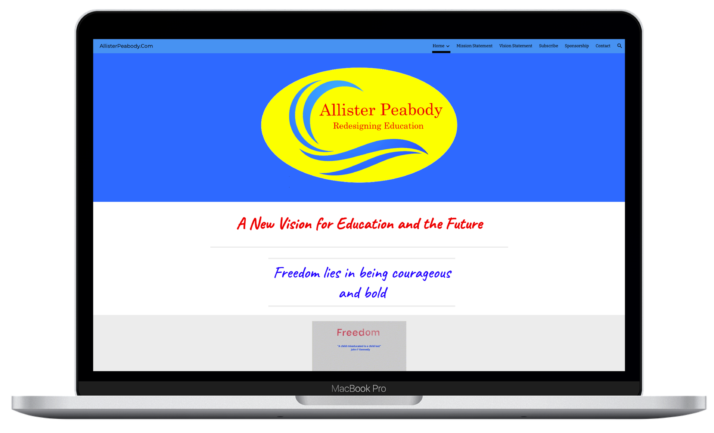
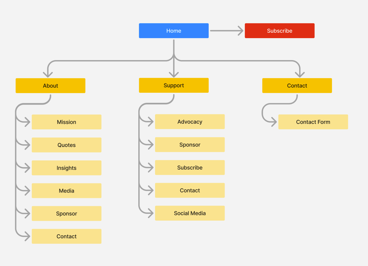
The existing site was structurally and visually static: text-heavy pages with no visual hierarchy, a logo and palette that felt dated, and no clear call to action guiding users toward involvement. The foundation needed a design partner who could push the work forward strategically while respecting the boundaries they'd set around their existing brand — a tension that shaped every decision in the project.
Before

My role
Lead graphic designer
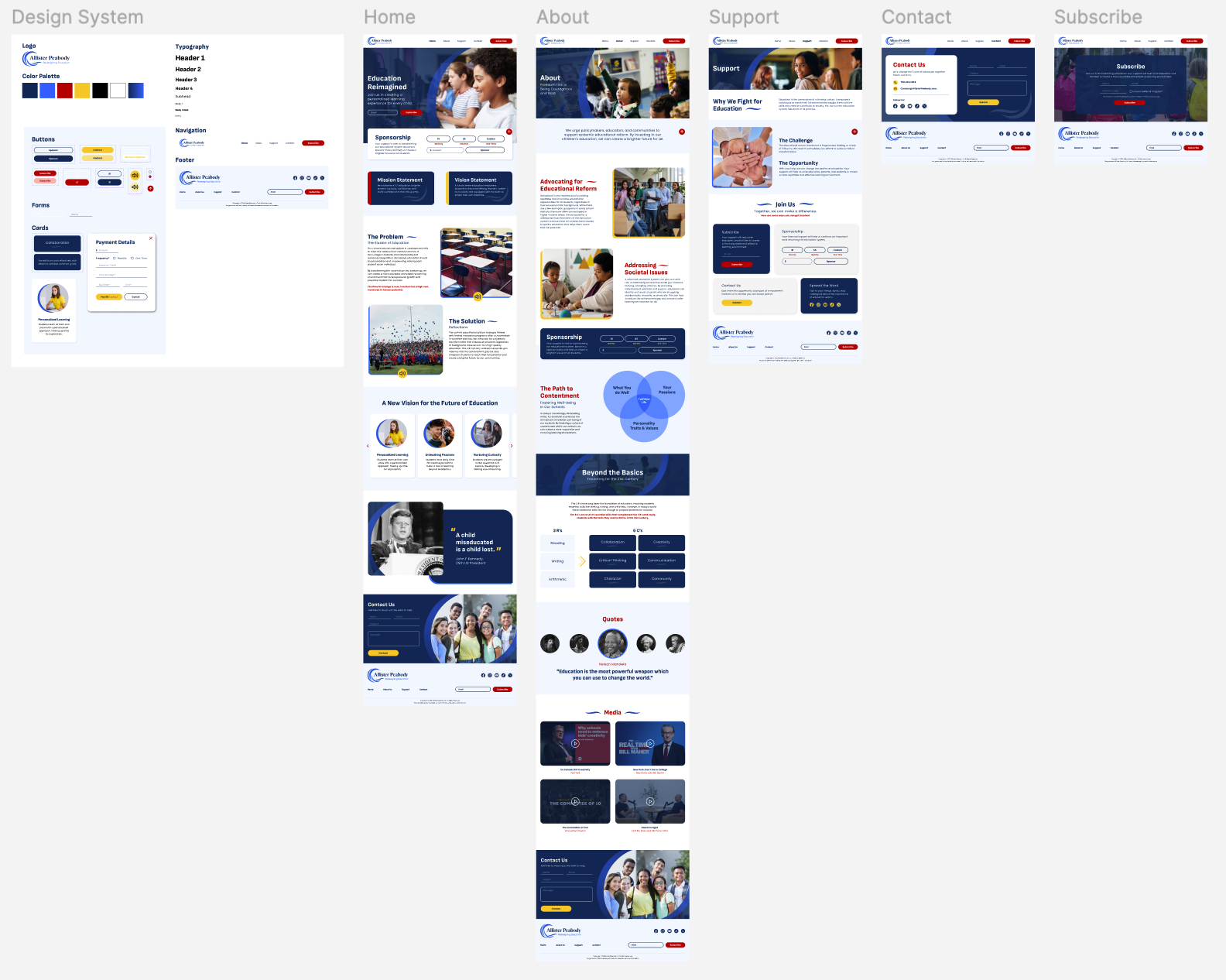
I was responsible for conducting visual research and developing a brand identity that aligns with the Allister Peabody mission and vision statements. This included designing a user-friendly, responsive website layout with strong visual hierarchy. And creating compelling visuals to showcase the impact of education reform, while not distracting from the information being presented.
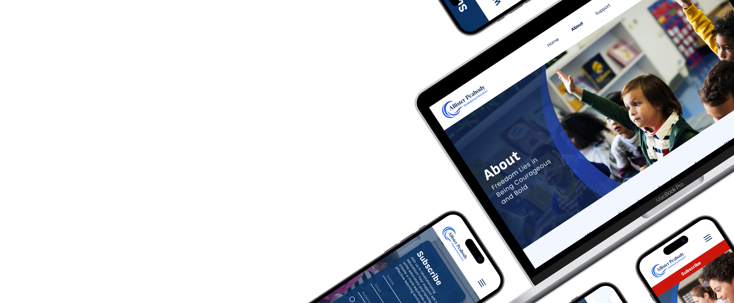
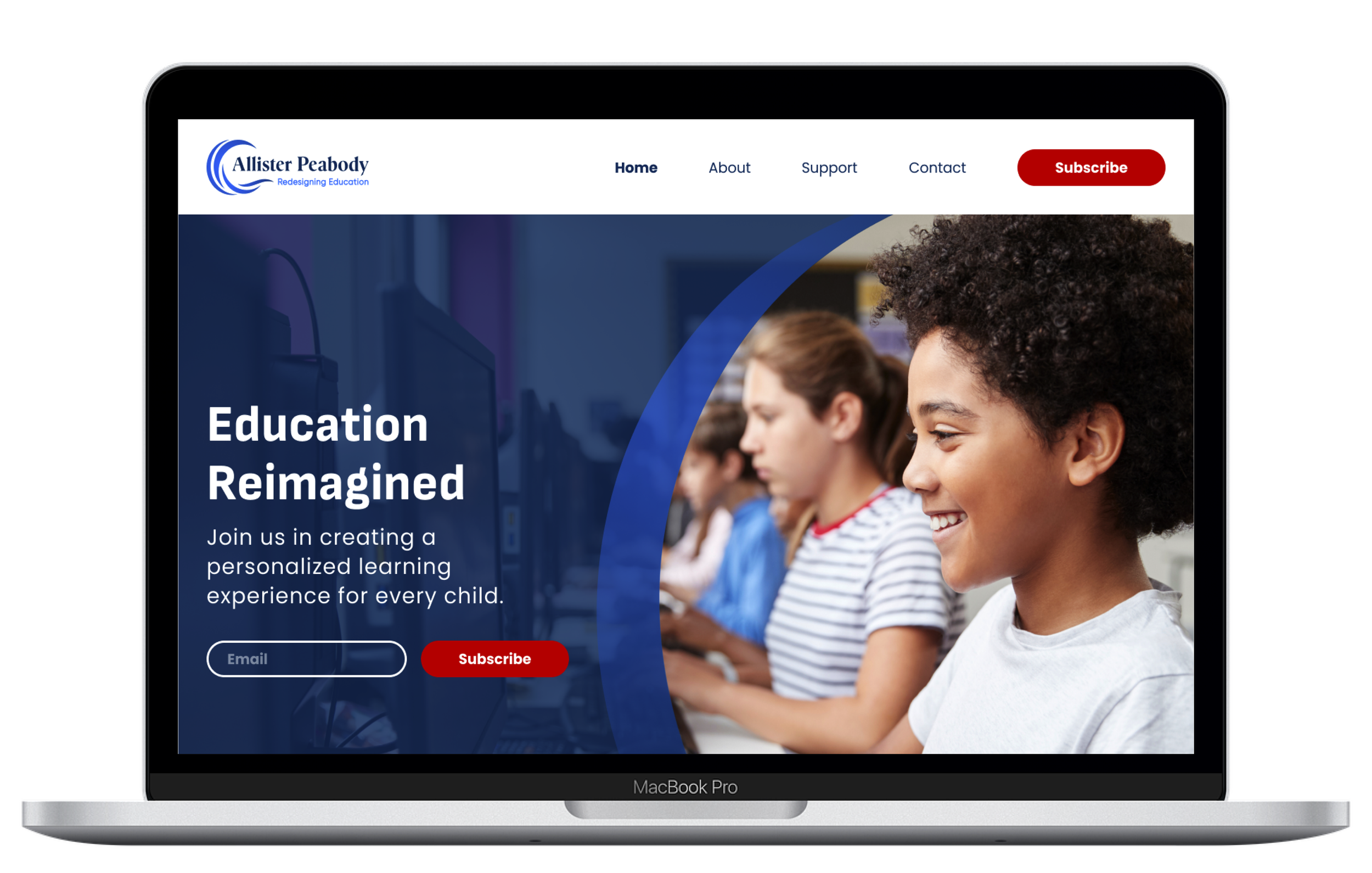
After

Process
Every stage filtered through one question: how do we build a system around the existing brand that makes it feel intentional?
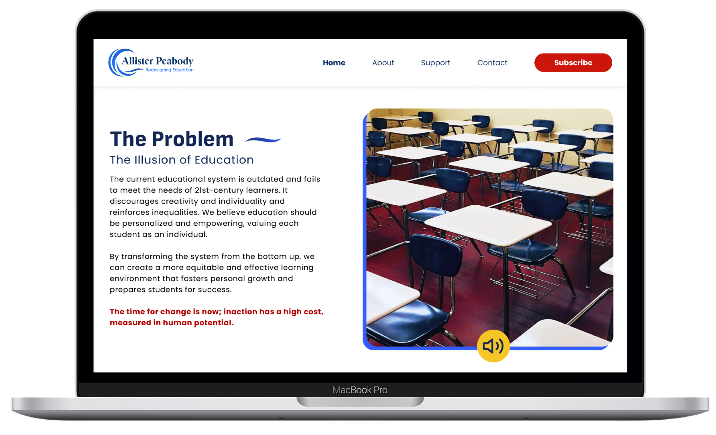
The design process began with getting a basic understanding of what the current website was trying to advocate for. From there I conducted research on the reform goals and the current state of the K-12 education system. Based on this analysis I decided the messaging and visual direction needed a refresh. A brand identity was developed, including a logo, color palette, and typography. The design aimed to convey a sense of trust, innovation, and optimism for the future of education. The next step was reorganizing the website structure to prioritize key information and make the website more user friendly. This included data visualizations, photographs of students engaged in learning, and inspiring quotes. And finally the website prototype was tested with potential users to gather feedback on clarity, user experience, and call to action effectiveness.


The solution
The redesigned website presents a modern and engaging platform that conveys the mission of the foundation and encourages users to take action and support their efforts.
The consistent brand identity creates a sense of professionalism and trust. The navigation is clear and intuitive, allowing users to easily find the information they need. Engaging visuals draw users in and effectively communicate the impact of Allister Peabody. A prominent call to action encourages users to get involved and support education reform.


The most meaningful breakthrough on this project came from reframing "we can't change the logo" as "how do we build a system around it that makes it feel intentional?" That shift unlocked the entire visual direction. It also reinforced that usability testing isn't just for validation — early feedback from potential users revealed that the original call-to-action copy wasn't motivating anyone, which led to a complete rewrite of the messaging before final delivery.
Working within a client's constraints isn't a limitation — it's a design problem.