WMH Solutions
Branding
Project Overview
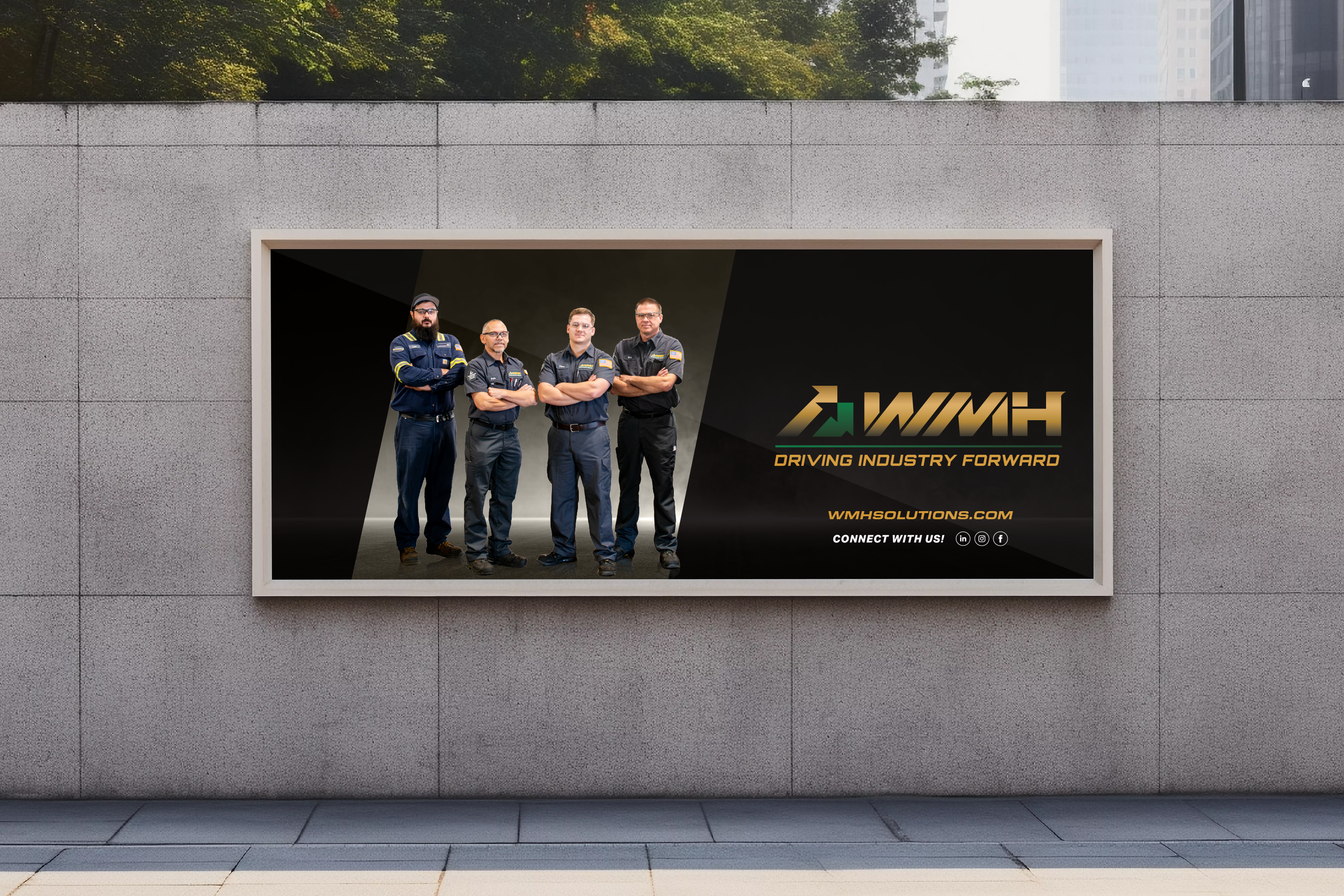
WMH Solutions is a material handling company based in North Carolina undergoing a full visual rebrand to better reflect its evolved positioning and attract a new tier of clients. Over six months, I worked as a graphic designer on a cross-functional team — alongside a senior designer, art director, marketing manager, and production manager — to redesign and produce the company's marketing collateral across print, digital, and video, anchored by a refreshed brand identity.
Tools


Role
Duration
Team
Graphic Designer
6 months
Senior Designer
Kristen Marzelli
Art Director
Sherelle Ledue
Marketing Manager
Angelina Lopez
Production Manager
Nicola Batchelor
The problem
WMH Solutions had grown beyond what its existing visual identity could communicate.
The old branding felt misaligned with where the company was heading — it conveyed neither the scale of their capabilities nor the professionalism their target clients expected. Inconsistency across touchpoints (trade show materials, digital banners, presentations, printed collateral) was compounding the problem: each piece felt like it came from a different company, making it harder to build brand recognition or trust in new markets.
My role
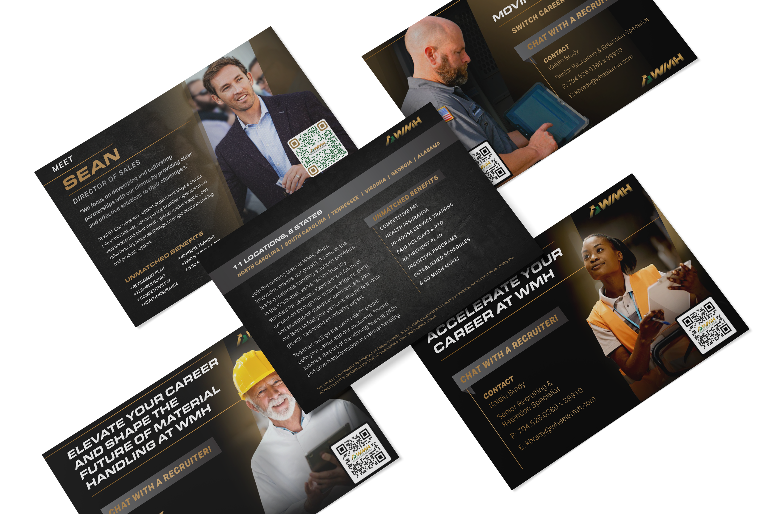
Executed the full rebrand across print, digital, environmental, and video — brochures to trade show banners.
I was responsible for executing the rebrand across the full suite of marketing assets — brochures, retractable banners, postcards, digital banners, and presentations — ensuring every piece adhered to the new brand guidelines. I worked directly with the marketing manager to understand how each asset would be used in context, and collaborated with the senior designer and art director on creative direction and quality review. I also contributed to video production assets as part of the expanded brand toolkit.


Process
I conducted a brand research, iterated on design concepts, and refined solutions based on feedback to ensure consistency.
The project began with a thorough review of stakeholder interviews and competitive research to understand where WMH Solutions sat in the market and where the brand needed to go. From that foundation, I developed initial design concepts for each asset category, presented them for feedback across the team, and iterated through multiple revision rounds. A key part of the process was building templates flexible enough for the marketing team to use independently after handoff — not just delivering finished files, but designing a system that could extend without breaking.
The completed rebrand gave WMH Solutions a unified, professional visual identity across every customer-facing touchpoint.
The solution
The new design system conveyed scale and credibility — matching the level of sophistication their target clients expected — while being practical enough for the internal team to maintain. The consistency across print, digital, and environmental materials (trade show banners, postcards) created a cohesive brand experience that hadn't existed before.
What I learned
This project taught me what it actually means to design for handoff.
Early deliverables I produced were visually strong but hard for the marketing team to adapt — too many custom decisions baked in, not enough system thinking. Feedback from the marketing manager was direct: the team needed to be able to update these assets without coming back to design every time. That pushed me to approach the remaining work differently — building with grid logic and component thinking, not just composing beautiful one-offs. It was my first clear lesson that good design at a company level isn't just about the output, it's about what the output enables.